
How Are Fonts Created? The Process of Making Morisawa Fonts
There is a wide range of fonts used in books, websites, signs, product packaging, and other things that we see every day. The choice of fonts has an impact on both people’s impressions and the readability of the text, so fonts play a pivotal role in design as well as conveying information.
But what goes into the process of completing a single font?
Font creation is much more than just designing the shapes of characters. It’s a process that starts with research and planning, followed by stages such as design development, character expansion, inspection, and commercialization before completion is achieved. There are also many people involved in this process, and in addition to type designers, there are type directors and engineers.
This article will take you through the Morisawa typeface creation process, a journey that starts with an idea and ends with the release of a fully functional font.

Table of Contents
1. Research

Many people think developing a font is a unique process, but the reality is that it occurs in a way very similar to general product development. And when it comes to deciding on a product to develop, research is an essential first step.
In the case of fonts, the type director is the person who comes up with a plan for what kinds of fonts to create. They cultivate concepts by drawing inspiration from all kinds of sources around town, such as logos, signs, books, and product packaging.

Sometimes they go out into the streets and take photos to document things that catch their eye. They also analyze trends in recent popular fonts and research data to consider what needs aren’t being adequately met by existing fonts.
By doing this, various things they encounter in their daily lives serve as inspiration for font development.
2. Planning
When research is complete, the next phase is planning. A project team is formed, and they proceed with development. This work involves the collaboration of the following individuals:

Type Director: Initiates projects and manages progress
Type Designer: Gives form to the characters according to the proposed design
Engineer: Makes the typeface design into a completed font
The project team shares concepts based on the research results and prepares to work out the details, such as expected use, design direction, the number of line weights to offer, and any other special features.
A font isn’t completed simply by designing the shapes of the characters. Creating a product that can function as it should in various environments requires the establishment of a range of details and technical specifications. This is the stage where a careful examination of the plan and concept is carried out to ensure feasibility and prevent the need for a major rework later in the development process.
Topics of Discussion in Planning Meetings
Concept: Design Direction, Expected Use
Specs: Character Sets, Weights (Thickness)
Special Features: OpenType Functionality, Additional Characters, etc.
When the direction of development is decided, work on designing prototypes begins. Multiple variations are created, and each one is evaluated across a range of characters to see if it still meets the intended purpose.

Sometimes, design motifs are created from scratch in-house, and other times inspiration is drawn from collaboration, for instance with calligraphers.
Inspiration can come from many different styles, not only for Japanese fonts but Latin fonts as well. Meetings about this are held throughout the year to help incorporate design trends.
3. Design Development
Once the concept is decided at the planning meeting, a team of type designers begins the design development stage, which serves as the initial step in creating a concrete form.

A single Japanese font can contain anywhere from about 4,000 to over 20,000 characters. The number of characters required depends on factors such as the range of weights and the character set, which defines how many characters are included.
Character sets for Japanese fonts are explained in detail in:
Instead of creating all the characters at once, Japanese font production begins by creating model characters that form the basis of the overall design.
There are about 400 to 600 model characters. They are the standards to ensure a sense of unity within a typeface, including aspects such as vertical and horizontal strokes, the balance between the left and right components of a kanji character, and the shapes of stroke endings, hooks, and sweeps.
While creating models, the team evaluates whether the concept holds up across various characters. Repeated and detailed checks are conducted from this stage forward, such as adjusting complex characters with many strokes so they don’t become too dark.
For example, Morisawa’s A1 Gothic was made on the concept of a warm Gothic typeface, which can be seen in the intricate layout of strokes and a softness reminiscent of handwriting.
More details of its creation can be found in:

The lead type designer is mainly responsible for this work, but it naturally involves collaborating with other designers and close communication with the type director.
4. Character Expansion
After the design has been finalized, character expansion comes next. This stage involves increasing the total number of characters to fill the specified character set, using the model characters as a base.

It depends on the project, but normally about two or three type designers will work on a single font. The work of creating the characters, which can range from a few thousand to tens of thousands, is split up by categories such as kana, kanji, numerals, symbols, and Latin characters.
Even with the aid of the model characters as references, it isn’t possible to create every character using the same parts.

The positions of each character’s dots are slightly adjusted, and the thicknesses are finely tuned, even in parts that appear to be a single line. Each character is crafted one by one, taking both the design concepts and readability into account while consulting with other designers.

Recently, there have also been methods of creating them using radicals or other elements. The team selects the most appropriate method based on the typeface concept.
Anytime there is uncertainty about a decision, the team is consulted immediately. By verbally sharing each other’s own visions and nuances, the designers can maintain a sense of unity throughout the typeface.
5. Inspection
Once the designed characters are ready, the next step is inspection.
In practice, fonts are rarely used with one character on its own. Instead, multiple different characters are almost always seen in combination with each other. Because of this, characters need to be checked for any areas that look unnatural when combined with others.

When sample compound words and sentences are typeset, differences in color or size relative to other characters become apparent. Inspection is carried out to see where adjustments can be made to make the text more natural-looking and easier to read.

These days, font creation is almost exclusively done on digital devices, but the way the font looks on paper is also important. So, inspection is not only carried out on screens, but also by printing it out on paper.
Time must be taken to repeatedly inspect and revise, while always looking very carefully. This is something that Morisawa has consistently valued in our approach to characters over the years.
6. Commercialization
Next, commercialization is handled by a team of engineers, who refine the finalized design data into a usable font.
The font is modified so that it can function correctly across various applications and be useful in the situations it was designed for.
・Outline Editing
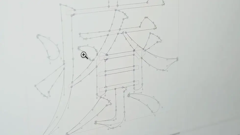
Outline editing involves reviewing the master data that was created in the previous stages. The reason is that parts can be flagged with errors during font creation, even if the design appears to be free of problems.
For instance, errors might occur when the outlines of certain parts are too close together, or if lines intersect at angles that are too sharp. As lines become thicker, the distance between them decreases, and finer adjustments need to be made.
Even if no errors are detected, it is still possible for problems to emerge, such as lines extending further than the intended boundaries, so a final visual check is carried out.
・Build
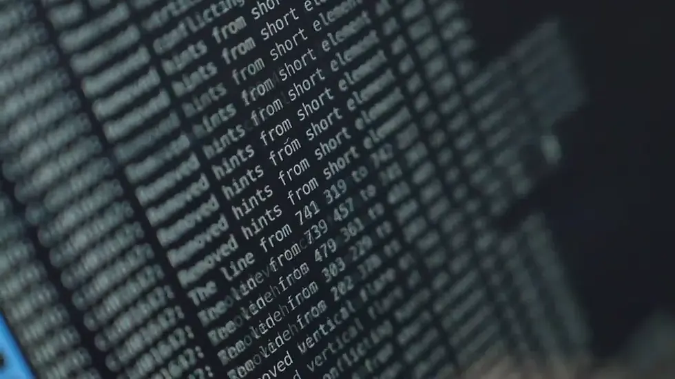
From here, we move on to what is called the “build.” It’s a process similar to programming, in which a character’s code is linked to its outline, and the system is configured to activate specific functions for the font.
Font-specific functions might include the ability to choose hentaigana (traditional variants of hiragana) while typing or being able to convert the text to a style in which kanji and hiragana are connected in a flowing cursive script called renmentai.

The italic of each weight for the Latin font Rocio Pro includes swash glyphs, decorative extensions on parts of characters. Switching between glyphs in this way is one of this font’s features.

Also, with the variable font DriveFlux, you can seamlessly manipulate parameters to adjust attributes like stroke weight and angle.

This is how the build stage implements features that align with its design concept into a font.
7. Final Evaluation
After commercialization, the final evaluation is held. Potential issues with characters and functionality are checked, and the font is verified to operate correctly with actual applications.
If it doesn’t work correctly, we need to confirm whether the issue lies in the font itself or in the application before making the necessary fixes.
In recent years, the roles and functions required of fonts have changed greatly. To make rich expression possible across a wider range of situations, implementing features tailored to each specific font is also important. This kind of work carried out by engineers provides invaluable support to the entire project.
8. Released at Last!
After all the production and inspection stages are finished and quality is ensured, it is finally time to release the font as a new typeface.

The process of completing a single font involves several stages, from researching market trends, recent design styles, and user needs to fleshing out a concept based on the resulting ideas, and finally to the design, technical development, inspection, and commercialization.
The fonts that we come across in our daily lives embody this unified thinking and the cumulative work that went into improving their quality. We hope that through this article, you could get a better understanding of the philosophy and process behind the creation of Morisawa fonts.
In addition, the concepts and techniques that create these fonts are also applied to the development of custom fonts for companies and brands. If you’re thinking about getting a font tailored to your business, either because you want to express your brand’s uniqueness through typography or because existing fonts fail to capture your vision, please feel free to contact us.


Comments