top of page
LATIN CUSTOM FONT SOLUTIONS
We offer a variety of custom font solutions. They range from designing brand new type families to modifying existing typefaces.

CUSTOM TYPEFACE DESIGN
We specialize in creating original designs. Through our collaborative process, we create a typographic voice that uniquely expresses your visual identity while carefully considering your functional needs across communication platforms. We will work together to determine the styles, character set, and special features specific to your custom typeface.

LOGOS & WORDMARK DESIGN
We can work with you to create and refine custom logotypes and wordmarks aligned with your brand. Our expertise will allow us to design for optimized legibility at various sizes.

TYPEFACE MODIFICATION
We have a large library of existing typefaces that can be customized to your needs — these can be great starting points for a new design. This process can be a more efficient and cost-effective strategy to tailor a typeface within a tight timeline.


VARIABLE FONTS
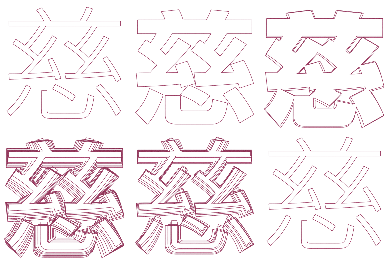
Our expertise in variable fonts allows us to deliver a single font file containing a range of styles. This format thrives on digital platforms, activated through animations and web typography. Our design and production process ensures that all points of the continuous design perform as well as the static instances.

LANGUAGE EXPANSION
We’re an internationally-oriented foundry: we have the infrastructure to offer Greek and Cyrillic support by default, and language support extends to Japanese, Traditional Chinese, Simplified Chinese, Korean and so on as we have Morisawa group around the world.
LATIN CUSTOM FONT PORTFOLIO

CLIENT: ENTERTAINMENT WEEKLY
Eduardo Danilo’s dramatic redesign of El Universal, a leading Mexico City daily, introduced Cyrus Highsmith’s Zócalo. The original text, display, and banner series was tuned for distinct character frequency and repetition when set in Spanish. Nicholas Kis’s oldstyle and C.H. Griffith’s classic newsface Ionic No. 5 inspired the sturdy text while the “energetic character of Mexico City” influenced the display and banner.

CLIENT: POPEYES LOUISANA KITCHEN
Chicken Script is a typeface designed by Victoria Rushton with agency Jones Knowles Richie, to complement their revitalized new brand for Popeyes Louisiana Kitchen. Inspired by inky sign painting and the festive culture of New Orleans, the contextual alternates for each character create the illusion of hand lettering, while lending a lively and distinctive voice to the brand.

CLIENT: ENTERTAINMENT WEEKLY
Cyrus Highsmith drew Scout and related logotype for Geraldine Hessler’s redesign of Entertainment Weekly. The large family marks the magazine’s first significant typographic update in a decade. Captions and sidebars are set in Regular and Bold; Light, Black, and Condensed styles form the backbone of the display. Scout’s form derives structural elements from both new & old: DIN, Venus, and Cairoli.

CLIENT: AARP
Cyrus Highsmith designed Salvo Sans & Salvo Serif (originally called Boomer Sans & Boomer Serif) as one series to tie together the designs of the AARP’s various publications. Together the Salvos illustrate the guiding sentiments of design director Courtney Murphy: “Hopeful, informative, alive, embracing and delightful. The right words draw people in, but on a subconscious level the typeface does that first.”

CLIENT: LA PRENSA GRAFICA
Kiosk in Spanish is Quiosco, the name of a second type series (after Prensa) designed by Cyrus Highsmith that follows W.A. Dwiggins in deliberately contrasting character outline with the counter shape. Highsmith addresses the narrow news column by bringing new life to the forms of a newspaper text face while adding nothing to character width. Quiosco permits more compact wordspaces with no loss of readability. It was commissioned by La Prensa Grafica.

CLIENT: BRIDES MAGAZINE
Biscotti was commissioned in 2004 by Gretchen Smelter and Donna Agajanian for Brides magazine. “We want a typeface that makes the reader feel pretty; it should capture the voice of this happy occasion.” Cyrus Highsmith has prepared a radically simple descendant of the flourished engraved scripts traditionally deemed suitable for such formal occasions, a 21st century typeface that captures the smiling spirit of these classical forms.

CLIENT: NATURAL HEALTH MAGAZINE
The cross between calligraphy and and sanserif is rare, inhabiting territory between Hermann Zapf’s Optima, classical sans structure with a calligraphic spirit, and Warren Chapell’s Lydian, classical calligraphy without serifs. Cyrus Highsmith claims adventurous new ground with Amira, a letterform that pops from the page with an angled vitality that both welcomes and surprises readers with bright new rhythms and texture. It was commissioned by Natural Health magazine.
OUR DESIGN TEAM
Our design team has many years of experience in type industry and have developed many high quality fonts not only custom fonts but also retail fonts, Logos, and Wordmarks.
Our crafted fonts will fulfill all your needs. Come drop us a line!

CYRUS HIGHSMITH
Cyrus is a letter drawer, teacher, author, and graphic artist. He teaches type design at Rhode Island School of Design (RISD). He wrote and illustrated the acclaimed primer Inside Paragraphs: Typographic Fundamentals. In 2015, he received the Gerrit Noordzij Prize for extraordinary contributions to the fields of type design, typography, and type education. In 2017, he became Creative Director for Latin Type Development at Morisawa USA. He goes to bed very early.
CONTACT
ABOUT OCCUPANT FONTS
Founded by Cyrus Highsmith in 2015, Occupant Fonts is relatively young compared to his 20+ years of experience as a type designer. We joined Morisawa in 2017 to be the Japanese type company’s Latin alphabet counterpart. We focus on developing original typefaces.
bottom of page
