
Designer Interview: Morisawa’s Font Development Shapes How a Message Comes Across
Updated: Aug 18

Font choice is a crucial element in shaping the impression of a design, which in turn influences how a company or brand is perceived.
Each font differs in form and weight, giving the reader a different impression. Those differences translate into the power to visually convey a company’s or brand’s uniqueness and message.
That is exactly why careful communication with the client is indispensable in the design field. Throughout that process, you can sense the conviction of designers who stay close to their clients while continually searching for the best possible expression.
Let’s take a look together at the ingenuity built up in such work.
We spoke with Yuka Honma, a type designer at Morisawa Inc. She has worked on fonts such as those used at a historic Japanese baseball stadium and the corporate font of a global automaker.
Profile Yuka Honma, Type Designer: Graduated from the Faculty of Fine Arts, Kyoto City University of Arts. After joining Morisawa Bunken Inc. in 2017, Honma transferred to Morisawa Inc. in 2018. She has worked on the development of the Japanese typeface “Chisaki,” Latin fonts, and a variety of custom fonts.
When clients commission a font, they usually have a specific goal in mind. What role do you feel a font can play?
Exactly as you say, there is always a clear purpose behind a client’s request for a font. Most frequently, clients aim to strengthen corporate branding by creating a new font that conveys the company’s image more precisely—for example, to unify the look of their advertising, or to make their in-house typographic expression consistent.
From what you’ve said, it sounds like clients feel a gap or inconsistency between their current expression and the impression they want to deliver, and they look to fonts as a way to resolve it, leading them to create their own font.
Yes. The client’s desire to “resolve an inconsistency” serves as the starting point of a project. The font born from it, I feel, plays an important role in giving form to the voice and stance the client wants to express.
It reaffirms that font development, like any other design work, is the job of giving form, together with the client, to the way they want to be seen.
Achieving that surely requires communication with the client’s point of contact. How do you convey the differences between typefaces to them and reach a shared understanding?
I make it a priority to first carefully ask the client’s point of contact about the basics, such as “what are you struggling with?” and “what kind of expression are you aiming for?” Understanding the issues they face from the start, and thinking through how to resolve them, is what leads to the concept behind the font.
Then I have the client describe the image they want to convey in their own words, and I reflect those nuances in the design. In turn, for the proposals we create, I put our intent into words and explain it to them.
By continuing this dialogue, our understanding gradually comes into alignment. I feel it is this steady build-up of dialogue that matters.

How do you think a font designed to match the client’s needs solved the challenges they faced?
Especially in corporate projects, I feel that the impression of the lettering—which had varied across media and affiliated companies—became unified through a single, consistent font, so the company’s voice and stance could come across more clearly. This, I think, is what leads to solving the challenge by reducing inconsistencies in impression and presenting the intended image more precisely. That said, because the evolution of technology and the environment can give rise to new challenges for the client, I believe it is important to maintain a relationship of trust and to keep supporting them through the font.
The process of translating the image a client wants to convey into typeface design must be a continuous cycle of trial and error.
What is especially key in the production process? I imagine it’s something common to every design field, not just typeface design, so I’d love to hear a concrete example.
If the result ends up out of step with its intended use, the work loses its meaning. So, the most important thing is to picture the actual scenes where it will be used and to test it in the real environment as much as possible.
For the baseball stadium project, we carried on the tradition of the serif typeface that had long been used, and the new font, too, was also decided to be a serif typeface.
This time, since the scoreboard was set from the start as the place of use, we visited the stadium and displayed our initial prototype to check how the design we had created would look in the actual setting.
As a result, we found that some characters blurred and became hard to read depending on the viewing distance and the scoreboard’s resolution, so from there we adjusted the stroke weights.
Because there are things you can only notice on-site like this, it was an experience that renewed my sense of how important it is to understand the environment where a font will actually be used.
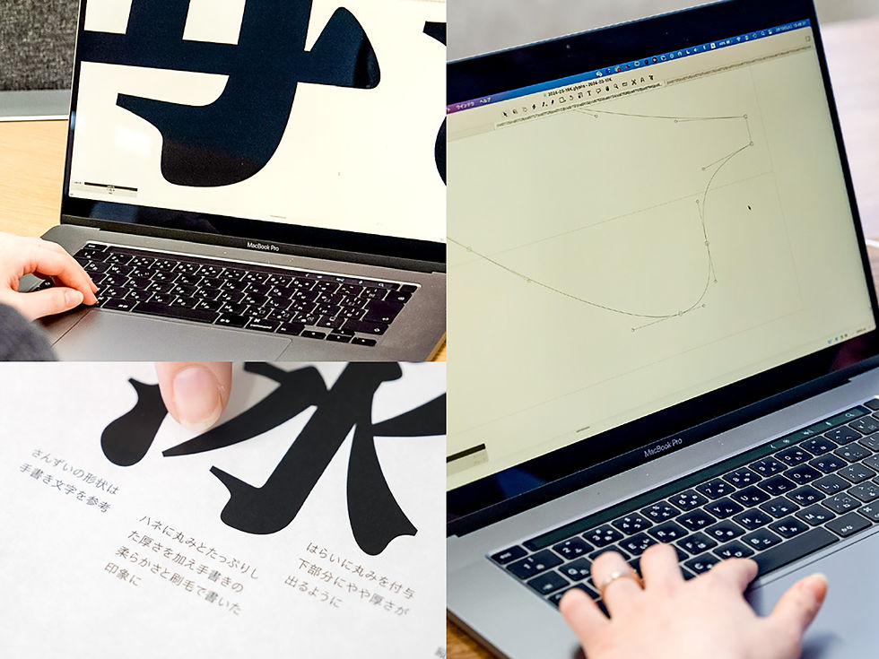
It became clear how carefully Honma reads the client’s intent and, through font development, refines the way it comes across.
Making a font involves a process of repeated dialogue with the client and of polishing the expression while verifying it in the real environment. It is that accumulation that underpins a font’s value.
This sincere approach to font development leads to higher font quality and to the trust of clients, which is why Morisawa remains the partner of choice.


Comments