
Multi-Script Typography Tips: Hangul and Latin
Brand names, product names, web addresses, units of measurement—in all kinds of settings, Hangul and Latin characters appear together quite naturally within the same sentence. The sight of different scripts sharing a single screen or page is no longer unusual.
From a typographic standpoint, though, the picture changes a little. Hangul and Latin are scripts with distinct histories and structures, so using the two together calls for careful attention to size, position, and proportion.

In real use, when Hangul and Latin are set at the same point size and placed side by side, one of them can look smaller than the other, or the two can look as though their visual centers are misaligned. This difference is not simply a matter of design preference; it comes from the structural characteristics of the two scripts.
In this article, we take a quick look at the structure of Hangul, at how Hangul and Latin differ, and at what to keep in mind when using them together.
Why Does Mixed Typesetting Matter?
In today’s design environment, using Hangul and Latin together is very common.
Brand and product names, of course, but also web addresses, email addresses, technical terms, units of measurement: a wide range of elements are expressed in Latin letters.
The sentence below, for example, reads perfectly naturally.

Combinations like this are not limited to Korean-language environments. As global brands multiply and multiscript environments become the norm, different scripts increasingly coexist within a single interface or brand experience.
When different scripts are not in harmony, however, the overall polish of a design can suffer, and the message can lose some of its power to communicate.
These differences affect not only the impression a brand wants to convey, but also the way users read content and take in information. In digital environments especially, they are one of the key factors shaping readability and user experience.
That is why it is so important for designers and content creators to understand the structural characteristics of both Hangul and Latin, and to find ways to bring the two into natural harmony.
What Kind of Script Is Hangul?
First, a brief introduction to Hangul.
Hangul is a script in which consonants and vowels are combined to form syllables. A leading consonant and a medial vowel form the base, with a trailing consonant added where needed, and together they make up a single syllable.
The character “한” (“han”), for example, is built from the leading consonant “ㅎ” (“h”), the medial vowel “ㅏ” (“a”), and the trailing consonant “ㄴ” (“n”). Readers do not read these components separately; they perceive the assembled syllable as a single character.
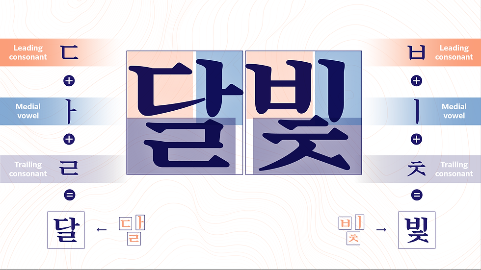
Hangul, then, has a distinctive structure: it is built syllable by syllable. That characteristic also shapes the visual rhythm the characters create.
For more on the history and structure of Hangul and how it is typeset, see Morisawa USA’s Hangeul Typography Explained: What Every Designer Should Know.
How Do Hangul and Latin Differ?
One major difference between Hangul and Latin lies in how they are composed.
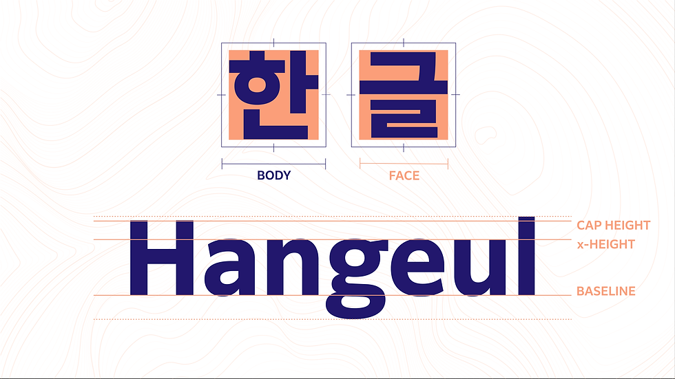
As noted above, Hangul combines a leading consonant, a medial vowel, and a trailing consonant vertically and horizontally into a square block, forming one syllable per character, while in Latin, individual letters line up horizontally, one after another, to make up a word.
The Latin spelling “Hangul”, for example, is made up of the letters H, a, n, g, u, and l arranged from left to right. By contrast, the same word in Hangul, “한글”, combines the consonants and vowels ㅎ, ㅏ, ㄴ, ㄱ, ㅡ, ㄹ as leading, medial, and trailing components, stacked vertically and horizontally to form the two characters “한” (“han”)and “글” (“gul”).
This difference also affects the visual rhythm of the text.
Because Hangul is a continuous run of relatively square character units, it tends to form an even rhythm. Latin letters, on the other hand, vary in width from one letter to the next, and ascenders and descenders introduce vertical variation as well.
The letters “i” and “W,” for example, differ greatly in width; “b” and “h” extend upward, while “g” and “p” extend below the baseline.
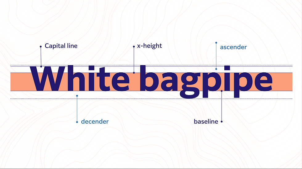
Latin letters are also generally designed around a baseline. Each letter sits on that same reference line, but its actual size and shape differ from letter to letter.
Because of these differences, Hangul and Latin may not read as the same size or the same visual weight even when the same point size is applied.
Why Do They Look Different at the Same Point Size?
A common issue when Hangul and Latin are used together is that the two look like different sizes even though the point size is identical. In general, when the two are set at the same point size, the Latin tends to look smaller.
This happens because the two scripts are designed around different reference points.
Because Hangul strings together character units of relatively even proportions, it tends to read as one cohesive visual mass. By contrast, individual Latin letters vary in shape and width, and form their rhythm around the baseline.
As a result, even at the same point size, the Latin can look smaller by comparison, or look as though it sits lower.
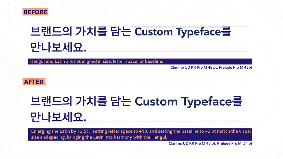
This is not a problem with any particular typeface. It is simply something that arises naturally when different scripts are combined.
What to Consider in Mixed Typesetting
When Hangul and Latin are used together, simply applying the same point size to both is sometimes not enough. Here are three points worth keeping in mind for mixed typesetting.
① Size
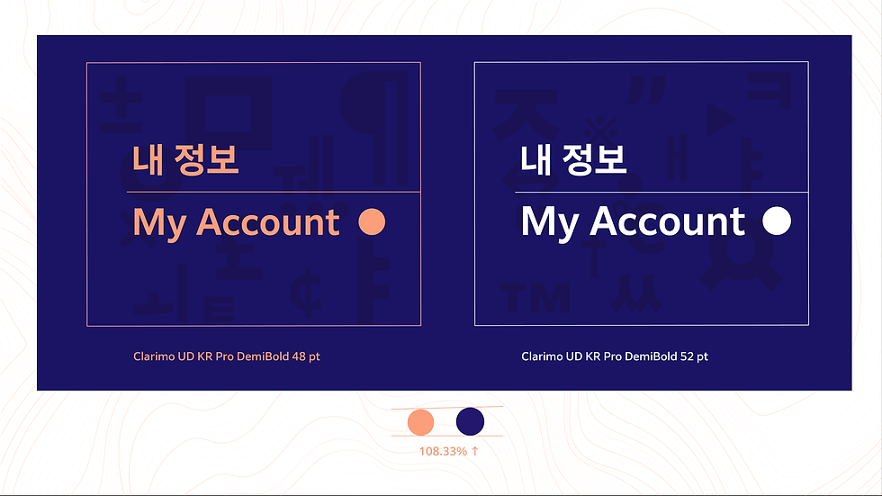
Even at the same point size, Hangul and Latin may not look the same size. That is why, in practice, designers often adjust point size based on visual balance, not just the numbers.
② Position
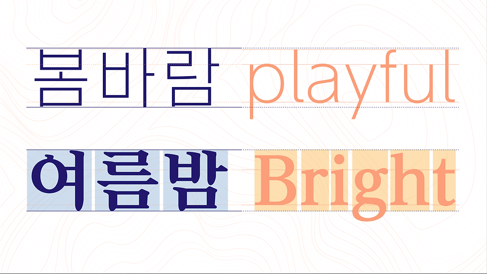
Because Latin letters are designed around a baseline, they can look as though they sit lower when used alongside Hangul. In that case, the choice of typeface and small adjustments to the details can produce a more natural balance.
③ Typeface Feel

The impression created by the letterforms matters too.
For example, a Hangul serif typeface (Mincho) is often paired with a Latin serif typeface, and a Hangul sans serif typeface (Gothic) with a Latin sans serif typeface.
These pairings are not absolute rules, of course. Depending on the aims of a project and the character of a brand, many other pairings are possible. What matters is understanding the characteristics of each script and aiming for a balance that feels natural and reads well.
With Morisawa’s custom fonts, we can build a typeface adjusted for mixed typesetting from the outset, and with existing typefaces, we can also supply a Hangul font whose subordinate Latin has been swapped for a different Latin font. Below is an example of a custom font developed by adjusting and integrating Clarimo UD KR with custom-designed Latin letters.

In Closing
Hangul and Latin are scripts designed on different principles, and natural mixed typesetting depends on understanding the structural characteristics of each.
That understanding leads to typography that is easier to read and more polished, and it offers a useful starting point for thinking about multiscript environments where CJK and Latin scripts coexist.

Comments