
Fonts Born from an International Type Award: The Morisawa Type Design Competition

1. A Century of Type Innovation – and a Platform for New Talent
For over 100 years, Morisawa has been shaping the landscape of typography – from print to digital media. Today, its library includes more than 2,000 typefaces supporting designers across industries and languages.
Among them are typefaces that began not as commercial products, but as competition entries – submissions from designers pushing the boundaries of what type can express.
In 2024, Morisawa revived the Morisawa Type Design Competition (MOTC) for the first time in five years, welcoming entries from around the world. The response reaffirmed something the company has long believed: innovation in typography thrives when new voices are given room to be seen.

Originally launched in 1984, MOTC was created to discover emerging talent and expand the expressive possibilities of type design. Over the decades, it has grown into one of the most comprehensive international type competitions, now encompassing five divisions:
Japanese
Latin
Simplified Chinese
Traditional Chinese
Hangul
A defining feature of MOTC is its blind judging process. Submissions are evaluated without revealing the designer’s identity, ensuring that recognition is based solely on the quality and originality of the work – not on reputation or career history.
In addition to the Morisawa Award, selected by a panel of distinguished judges, the competition also includes a Fan Vote, allowing the broader design community to participate in recognizing standout work.
In the sections that follow, we highlight selected typefaces that began as award-winning entries and later evolved into fully realized commercial releases – along with insights into what caught the judges’ attention.
For full competition details and archives of past award-winning entries, visit the official MOTC website.
Table of Contents
Let’s begin with selected typefaces from the Japanese category – designs that embody expressive originality and technical refinement.
2. Japanese Category Highlights
Suzumushi
MOTC 2012 – Bronze Award, Akashi Award, Fan Favorite
Commercialized in 2014
Since its release, Suzumushi has become especially popular in Japan, frequently appearing in packaging and brand design.
Its generous, ink-rich strokes evoke the feeling of brush lettering – full, rounded, and subtly fluid. At first glance, it may appear hand-drawn. Yet beneath that warmth lies careful structural control.
Many of its forms are built from deliberately organized lines, with distinctive “ink pool” elements used strategically to create rhythm and character. The judges praised not only its charming personality, but also the discipline underpinning its construction. The balance between expressive brush energy and typographic refinement ultimately distinguished it among the entries – earning it a rare triple recognition in 2012.
Explore the full specimen and technical details on the Suzumushi product page.

Suzumushi expresses warmth through brush nuance – yet other MOTC winners explore boldness in entirely different ways.

Manpuku Maru
MOTC 2019 – Fan Favorite
Commercialized in 2024
Defined by its distinctive weight distribution concentrated toward the lower halves of characters, Manpuku Maru presents a bold, retro-inspired aesthetic that immediately captures attention. The visual emphasis along the lower halves of characters gives the typeface a grounded, nostalgic presence – reminiscent of vintage signage yet refined for contemporary use.
Its selection through the Fan Favorite Vote reflects that immediate appeal – an eye-catching presence paired with a surprisingly versatile balance that designers can envision using right away.
Explore the full specimen and technical details on the Manpuku Maru product page.


While Manpuku Maru channels retro boldness and graphic punch, Nibushibu explores a more controlled and structural approach to expression.
Nibushibu
MOTC 2019 – Silver Award
Commercialized in 2024
Nibushibu is distinguished by its bold, signboard-inspired gothic (sans-serif) structure. Generously rounded forms and flattened proportions create balance between density and openness.
Judges noted the thoughtful handling of visually complex characters, particularly the way dense kanji and simpler forms coexist without imbalance. The result is a typeface that feels carefully calculated yet expressive – maintaining readability while establishing a distinct graphic voice.
Explore the full specimen and technical details on the Nibushibu product page.


Where Nibushibu refines density and rhythm within Japanese script, the next award-winning typeface explores expression through a distinctly different structural language.
Nijitakotengoku
MOTC 2019 – Honorable Mention
Inspired by the rhythm and discipline of classical Chinese calligraphy, Nijitakotengoku reinterprets traditional brush forms through a contemporary typographic lens.
The design is distinguished by its sweeping strokes and sharply modulated terminals, creating a dynamic interplay between tension and release. Judges praised its expressive energy and structural backbone – a typeface that feels both rooted in tradition and unmistakably modern.
Explore the full specimen and technical details on the Nijitakotengoku product page.


Turning to the Latin category, the award-winning typefaces reveal a different set of typographic priorities – clarity, proportion, and expressive control within alphabetic systems.
3. Latin Category Highlights
Rubberblade
MOTC 2012 – Akashi Award
Commercialized in 2014
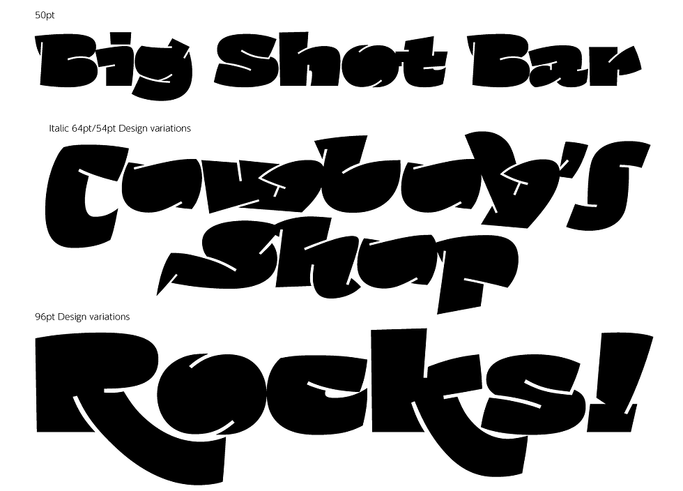
Pushing strokes to the very edge of legibility, Rubberblade transforms dense black forms into expressive letterforms carved by sharp internal cuts. Originally recognized at MOTC 2012 with the Akashi Award and later commercialized in 2014, the design stood out for its bold experimentation and graphic intensity.
The judges commended its unconventional line treatment – a departure from ordinary stroke construction – noting both its originality and strong visual impact. Despite its dramatic presence, the typeface maintains structural coherence, balancing playfulness with deliberate control. The addition of italic styles in its commercial release further expands its expressive range.
Explore the full specimen and technical details on the Rubberblade product page.

If Rubberblade pushes structure through experimental line tension, the next award-winning typeface amplifies impact through scale, weight, and unapologetic visual energy.
Heavy Display PE/Heavy Text PE
MOTC 2016 – Silver Award
Commercialized in 2024
Rooted in the raw energy of rock music and bold visual culture, Heavy Display PE and Heavy Text PE deliver immediate impact through exaggerated weight, compressed counters, and assertive rhythm.
Judges recognized the typeface for its rare balance of expressive originality and functional strength – a design that feels loud and unapologetic, yet structurally sound and highly usable.
The commercial release expands the concept into a versatile two-family system: Heavy Display PE, optimized for headlines and visual impact, and Heavy Text PE, refined for structured text environments while retaining the design distinctive personality.
Explore the full specimen and technical details on the Heavy Display PE and Heavy Text PE product pages.


From amplified volume and visual intensity, the focus now shifts toward refinement, versatility, and typographic breadth with Aeron Pro.
Aeron Pro
MOTC 2019 – Gold Award
Commercialized in 2022
Aeron Pro is a contemporary serif typeface inspired by the disciplined elegance of pen calligraphy. Awarded the MOTC 2019 Gold Award, it balances approachability with structural precision, making it equally effective in extended text settings and refined display applications.
The family includes six styles each for Roman and Italic, forming a robust multilingual system supporting both Latin and Hangul. Judges praised the typeface for its thoughtful expansion into a large, cohesive family – noting that while it offers extensive stylistic range, it remains exceptionally well-crafted as a complete type system.
Its strength lies in clear proportion and controlled modulation, delivering nuance without sacrificing readability. Whether used in editorial layouts, brand communications, or screen-based environments, Aeron Pro demonstrates versatility grounded in typographic discipline.
Explore the full specimen and technical details on the Aeron Pro product page.


Aeron Pro stands as one of MOTC’s most fully realized evolutions – from competition entry to comprehensive type system – yet it represents just one chapter in a much broader story of award-winning design.
4. Other Award-Winning Typefaces from MOTC
Beyond the typefaces featured above, many more works have made the transition from MOTC recognition to full commercial release.
While we cannot introduce them all here, we invite you to explore the following award-winning works and discover the breadth of talent emerging from the competition.
MOTC 2014
Gold Award
Hola (commercialized as Lima PE, 2022)
Bronze Award / Akashi Award
Kulin (commercialized as Rocio Pro, 2022)
Honorable Mention
Flipper (commercialized as Backflip Pro, 2021)
Kitahara Gyosho (commercialized as Kinrei Gyosho, 2016)
Harmony (commercialized as Shirotae / Shirotae Old, 2022)
MOTC 2016
Bronze Award
Abelha (commercialized as Abelha Pro, 2022)
Shimanami (commercialized in 2018)
MOTC 2019
Honorable Mention
ER Canto (commercialized as Cetra Text Pro / Cetra Display Pro, 2022)
tr (commercialized as Kuromame, 2022)
Explore the MOTC Archive
For the latest announcements and the full history of award winners:
Visit the MOTC Official News Site
Browse the MOTC Awards Archive (2014-2019 and beyond)
MOTC 2024 Concept Movie
Watch the MOTC 2024 Concept Movie, “Motivating Timeless Creativity,” on YouTube.
5. Final Thoughts
Since its inception, MOTC has championed bold ideas and individual expression – serving as a launch point where experimental concepts evolve into typefaces that shape real-world communication.
From competition entry to commercial release, each project represents a dialogue between designer, judge, and industry. We hope this feature not only highlights that journey, but also sparks inspiration for your own typographic explorations.
As new releases continue to emerge from MOTC, we invite you to follow the competition and witness how today’s bold ideas evolve into tomorrow’s type.


Comments