top of page

CASE STUDY 07
Shibuya City Portal
Shibuya City
A New Standard for Digital Public Services
Shibuya City Portal Renewal
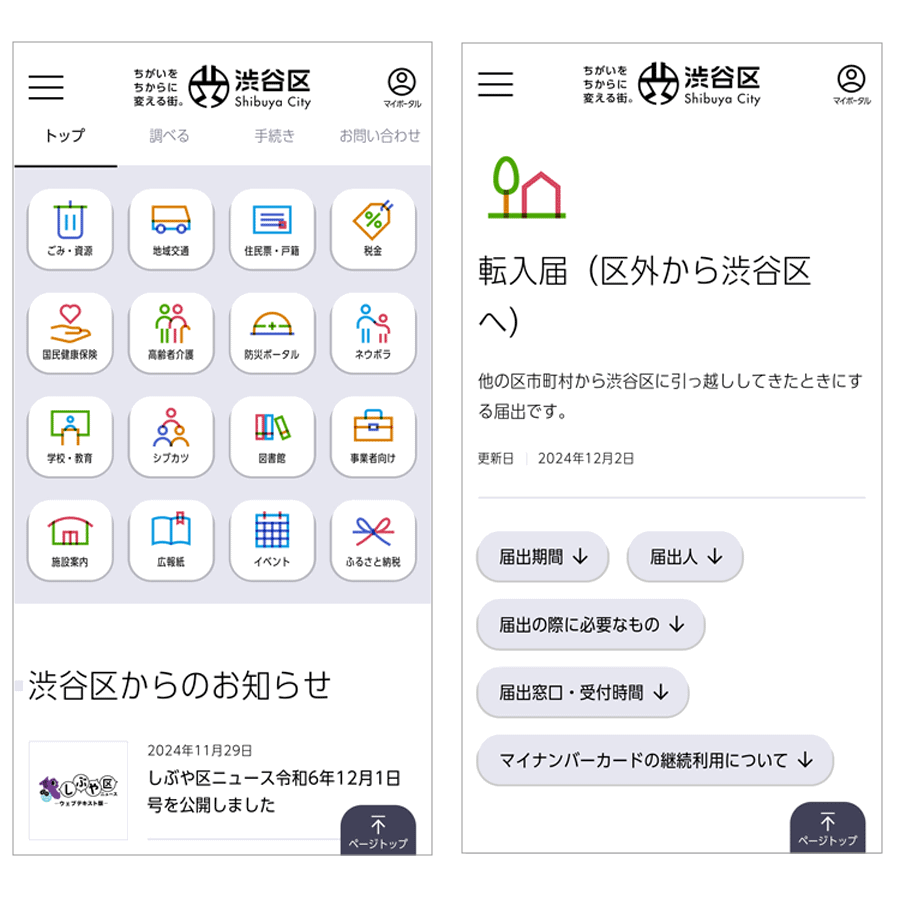
Mobile view of the renewed Shibuya City Portal, designed with a smartphone-first UX and optimized for readability and accessibility using UD Shin Go Condensed 90.
Shibuya City is one of Tokyo’s leading centers of commerce and culture, and is internationally recognized as a highly visible urban district. The Shibuya Scramble Crossing—an image many people associate with Japan—stands as one of the most iconic scenes representing the area.
With the future vision of “Shibuya—turning differences into strength.”, the city continues to pursue initiatives that reflect social change. As the primary means of accessing information has shifted from desktop computers to smartphones, Shibuya City renewed its official website, the Shibuya City Portal, in March 2023. One of the key objectives of this renewal was to improve convenience while strengthening information delivery.
Based on the concept of avoiding a “government office that no one visits,” the portal was redesigned with a smartphone-first UX as its foundation. The site’s information architecture was reorganized from the perspective of users, with the highest priority placed on readability and accessibility, aiming to create a public website that leaves no one behind.
While the renewed portal incorporates many design innovations, typography plays a particularly important role. As a web font, the site adopts Morisawa UD Shin Go Condensed 90. In addition to its UD (Universal Design) characteristics that support strong legibility and readability, the condensed structure allows more information to be displayed naturally—even on smartphone screens—without compromising clarity.
Font size, line spacing, margins, and color contrast were also carefully adjusted, ensuring ease of reading across a wide range of age groups and usage environments.
This project has received high recognition for its user-first design philosophy, earning The GOOD DESIGN AWARD 2025 and being selected as part of The GOOD DESIGN BEST 100.
As digital transformation becomes an increasing priority for municipal websites, the Shibuya City Portal is positioned as an initiative that serves as a model case for public-sector digital services.

Mobile navigation and content views of the Shibuya City Portal, demonstrating clear information hierarchy and accessible typography optimized for everyday public services.
Fonts Used: UD Shin Go Condensed 90

bottom of page